In today’s digital world we value speed and simplicity. But somehow the potentially engaging activity of looking for a new office space or a meeting room is actually quite the opposite. Let’s disrupt this. What would an engaging and efficient platform look like?
Booqed is a marketplace for flexible spaces for work-related activities like meetings, conferences and just your everyday work.
The goal of the product is to make it easier for people and businesses to find spaces they need efficiently while helping landlords monetize their properties.

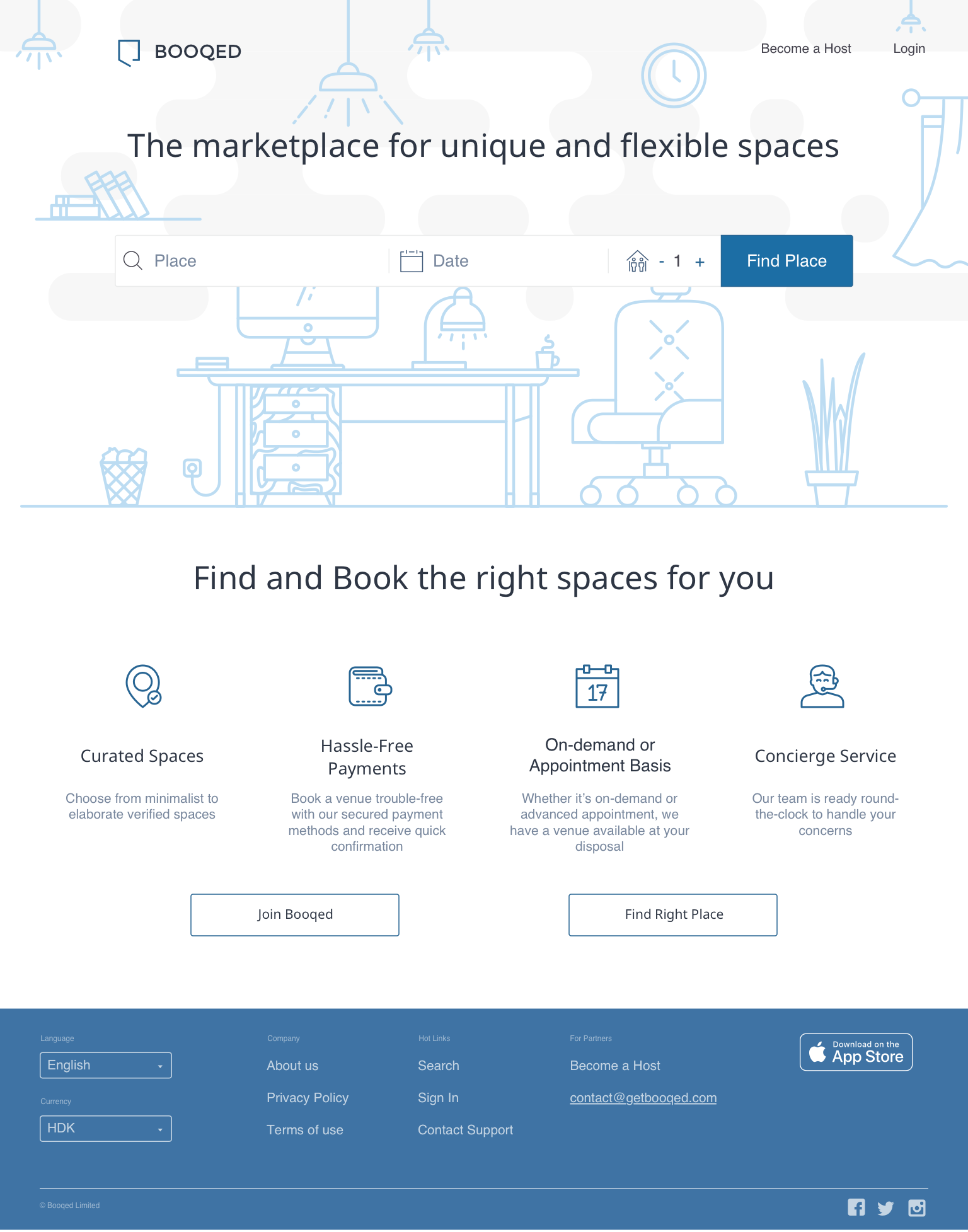
Many users had difficulty using the system without help from Booqed team or couldn’t find a feature they needed to accomplish the task.
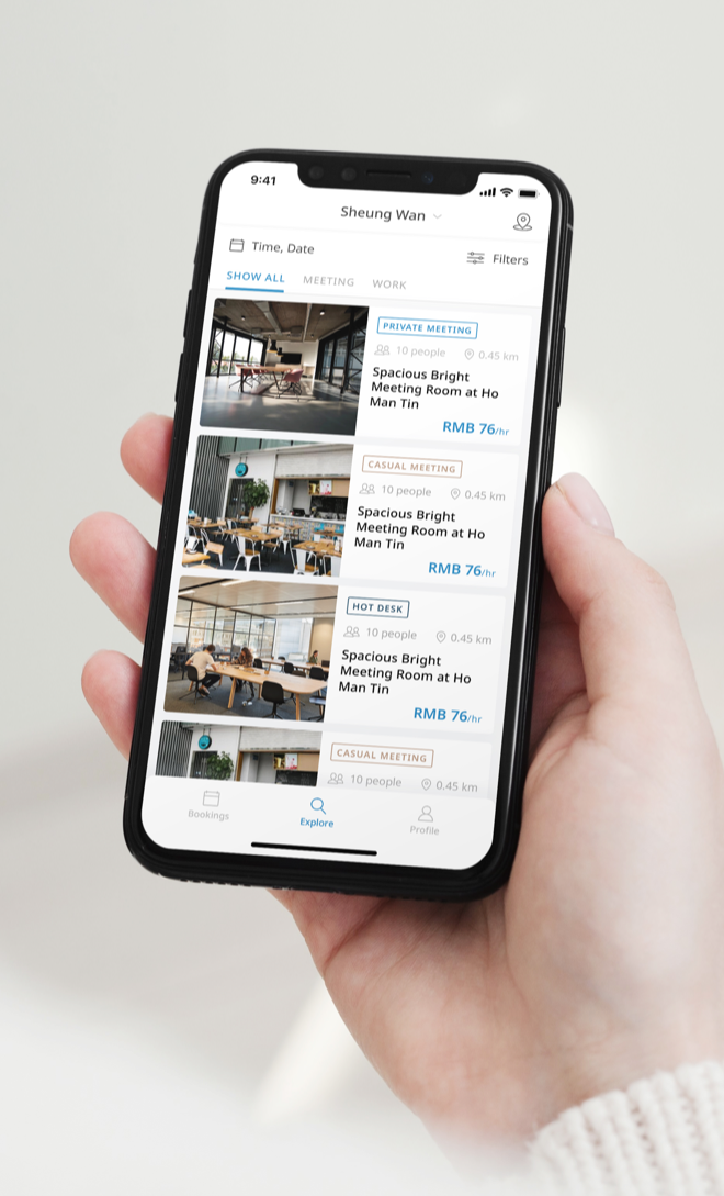
The main use case - ‘book a space on the go’ wasn’t supported by the platform because of the absence of the mobile app.

The platform offering and message weren’t clear enough so the users weren’t aware about their potential benefit from the platform and product.

The analytics weren’t used on the platform which makes the business to make blind decisions.
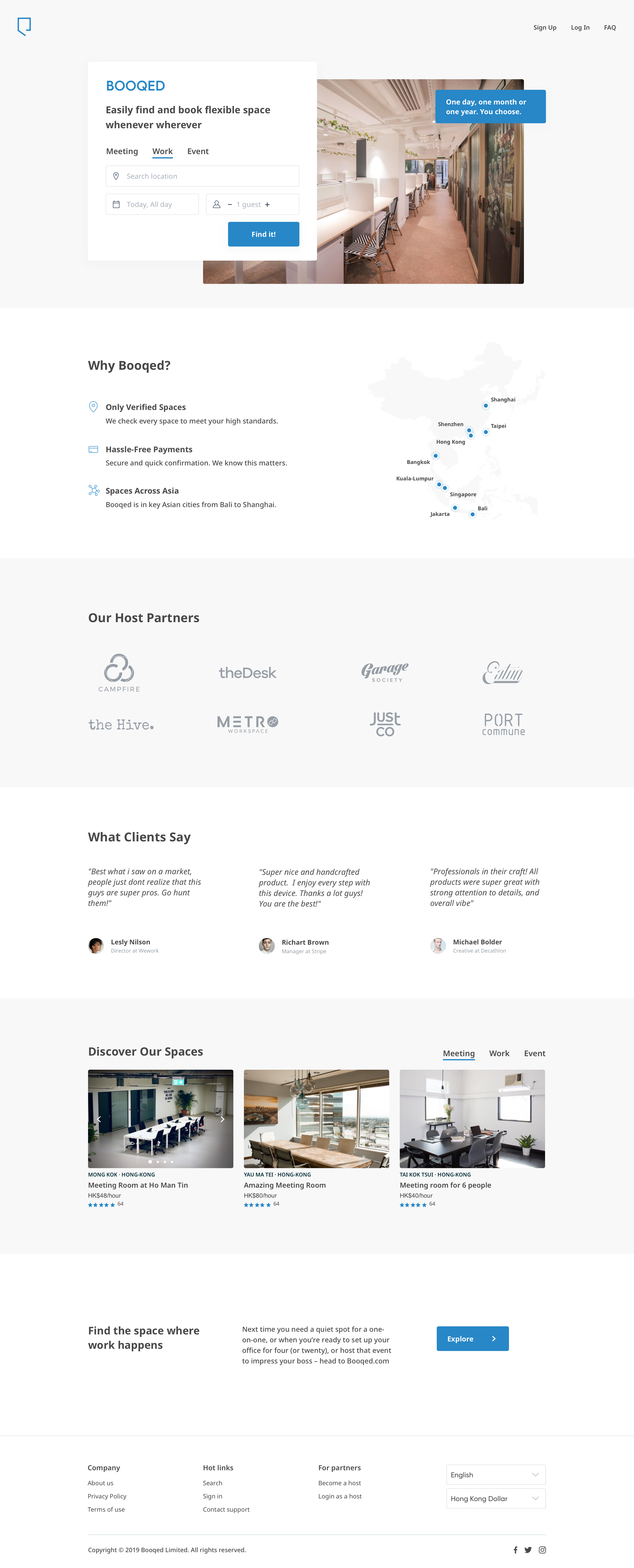
We started working together while Booqed was taking a part in Colliers Proptech Accelerator program powered by Techstars here in Toronto just two stories above our company office.
Booqed’s services have proven to be popular in Hong Kong, where space is scarce and real estate costs are high, according to the company CEO. Their web app has over 1,500 active users. Over the last six months, the company has helped to lease about HK$150,000 worth of space.
The platform has two main parts:
- Business facing - for hosts and landlords who want to make their real estate more profitable. Think of any co-working spaces, offices or event venues whose hosts want to make them easily accessible for online bookings.
- Clients facing - for people who want to effectively rent out the flexible working space for a short or long term avoiding the complicated procedures anytime, anywhere.
Some of the processes on the platform required a lot of manual work and ongoing support from Booqed team due to complicated UX or the absence of a feature. It was one of the bottlenecks that they needed to overcome in order to start an effective scaling process. We had to move quickly to provide everything needed for the upcoming round of investments, nevertheless develop a user-friendly product.
Since we needed to add new features on Booqed platform and bring up to date the look and feel, we decided that it was a great opportunity to rethink the user experience holistically, rather than just reskin the interface and build on the features.
This is why. Coming from a background in architecture I always compare this process with the actual building construction. Imagine that someone asks an architect studio to update the building's look with modern panelling, also build on a couple of floors on top, while adding an open deck with solar panels instead of the hipped roof and so on... You won't be surprised that the professional company won't start doing everything right away. They will perform the inspection of the building foundation and the construction state to make sure that the additional weight and changes won't compromise it and will be safe to accommodate the inhabitants. The same applies to the field of software design and development.
As a designer, I often run into situations where people have different ideas about design decisions; it can be tough to judge without any principles. That is why based on our collective experience we collaboratively set core design principles among our design team:
1. Know Your User,
2. Provide Clarity - everything should be as transparent as possible,
3. Stay Consistent - be familiar across all channels,
4. Utility - it must solve a compelling user issue,
5. Efficiency - the product must work seamlessly and the task achieved timely,
6. Beauty.
The question we kept asking ourselves was:

What if utility was beautiful and timely?
- Discovery phase with one of the founders. Product roadmap creation with the deep understanding of the business goals. Competitive landscape analysis.
- Design and Usability Audit of the existing system.
- Analyzing the feedback on existing product. Talking with the customer success team members.
Once we were aligned on how people use our product, we needed to understand their pain points with the existing UX. The Booqed team worked effectively and collaboratively with us and we all were invested in building a great experience for our users.
Many people on the Booqed team mentioned that various aspects of the platform needed improvements. To leverage their knowledge, we decided to conduct a series of internal user studies. Our goal was to understand the biggest pain points in the user experience and fix those aspects.
Here are some of the findings that were clearly the first candidates for our unf*cking process:
- The process of the listing creation was a huge pain for the business side users as well as for the Booqed team. The managers of the coworking spaces struggled with the necessity to fill out the gigantic form. This was not their only struggle, in order to successfully upload a listing the customer success team was manually explaining this was done. It wasn't a scalable solution.
- The prominent problem of the interface’s guests was an absence of the mobile app that would give them the ability to arrange a meeting or "shop" for space on the go.
- Defining the user personas for both sides of the platform for the host and the guests.
- Splitting the system into the functional parts.
- Mapping out the user journeys for the both sides of the platform.
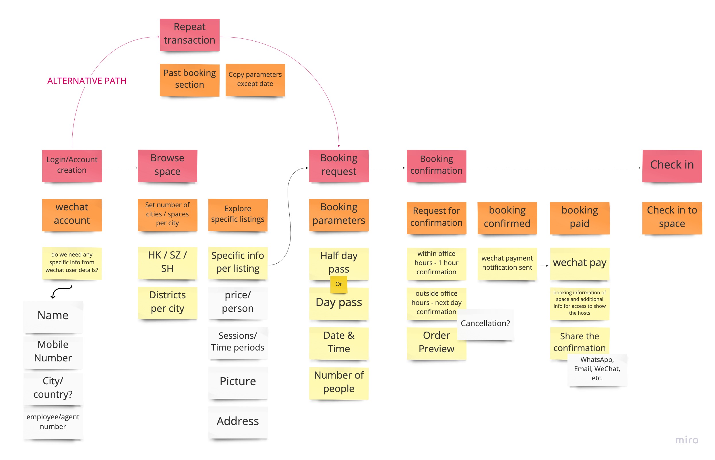
We mapped out each of the user journeys into flows using specific personas. It was an investigative and fixing process with the main goal being the implementation of easing the main pain points that users experience while using the existing system.
We shared these journeys with the team and revised the flows as needed. The result of this phase was the main user journeys and the foundational understanding of how users use the product.
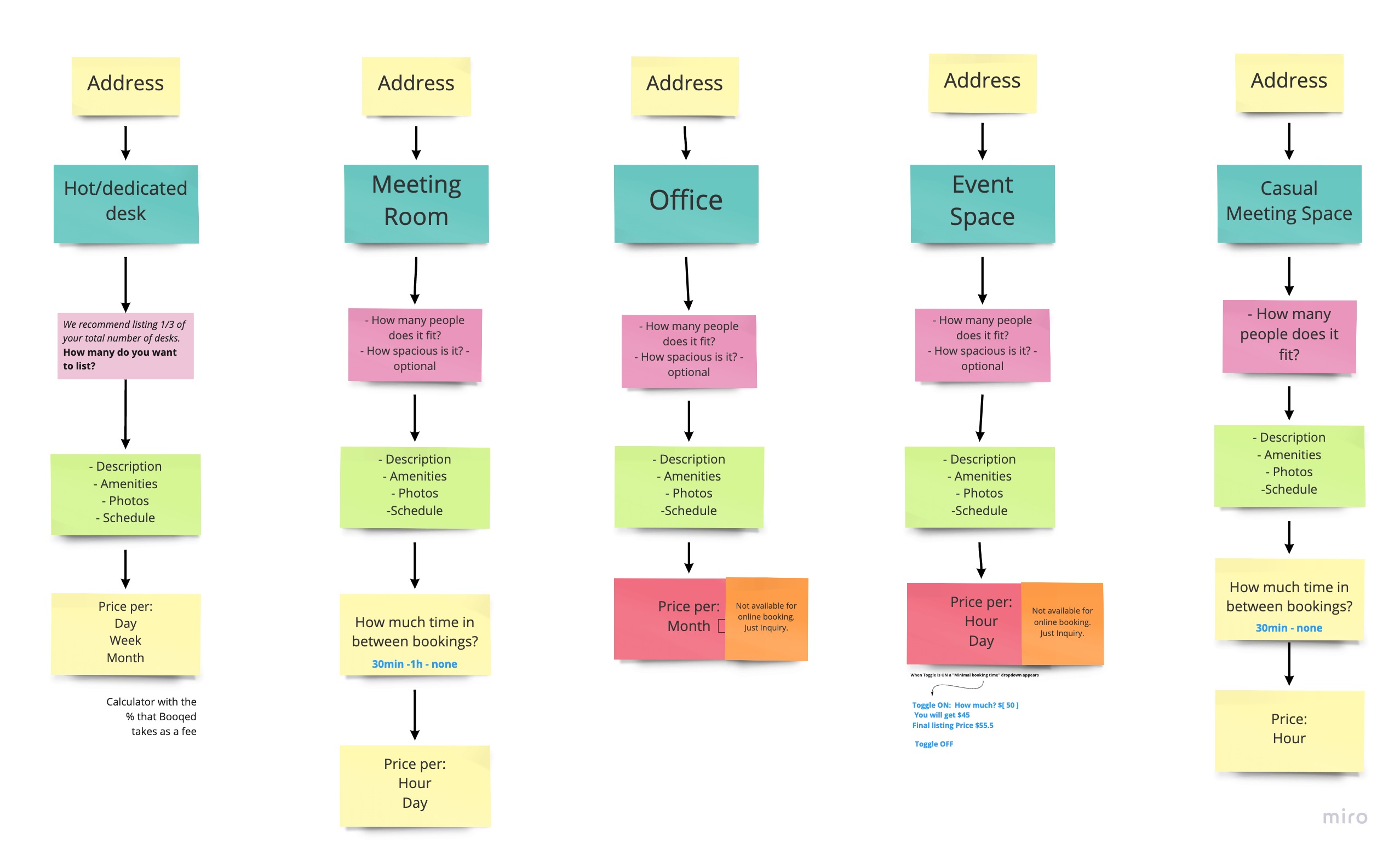
One of the results in this phase was a new approach to the list uploading flow. Beforehand, it was one huge form that was used to list all kinds of property. We decided to split it into tailored flows to cut out the unnecessary steps to create streamlined searches easier for users.
Some of the examples of the user flows:
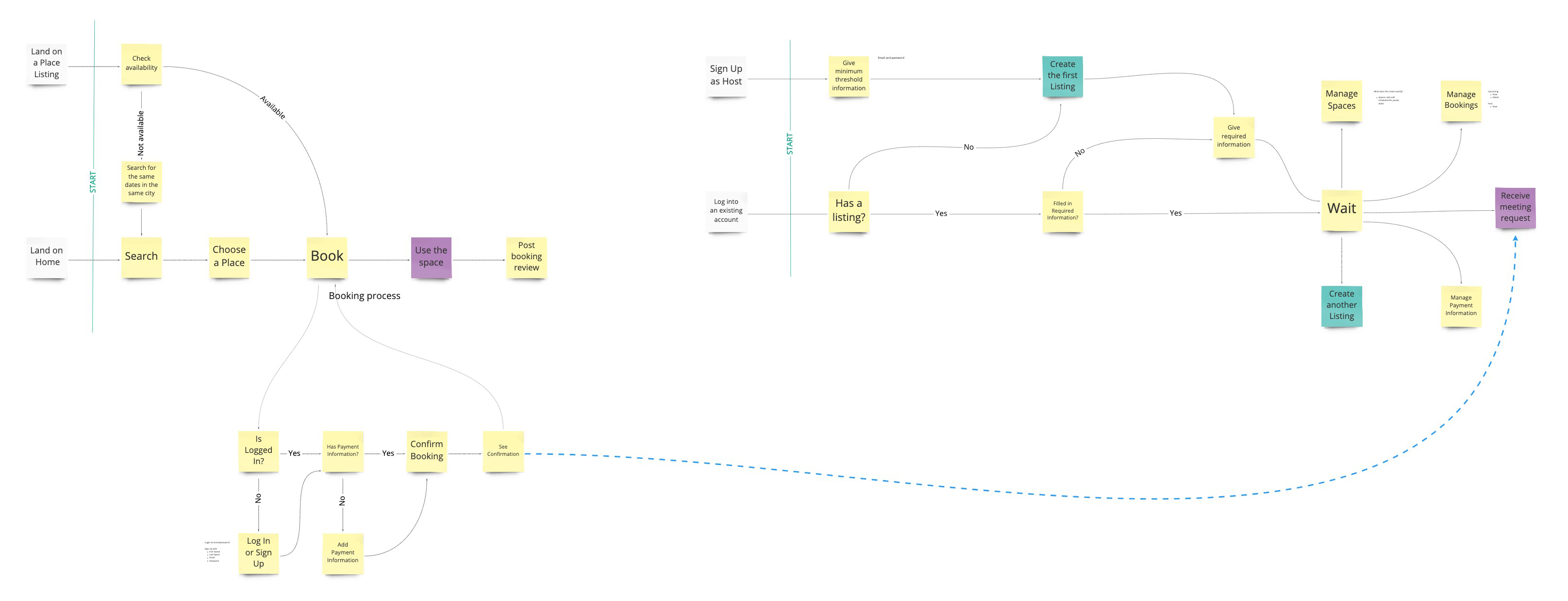
More detailed flows base for some of the functional parts of the system:
- The creation of wireframes for the most complicated and foundational parts of the system.
- Showing and testing the low fidelity prototypes with the customer success team.
- Establishing of the look and feel based on the user personas and usage scenarios.
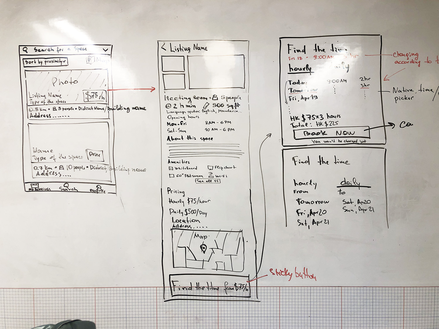
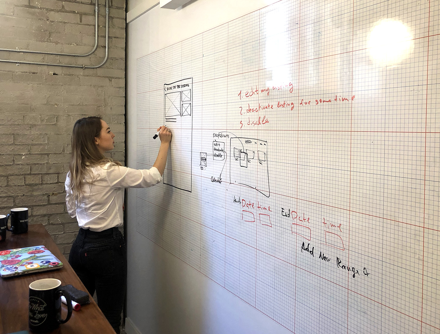
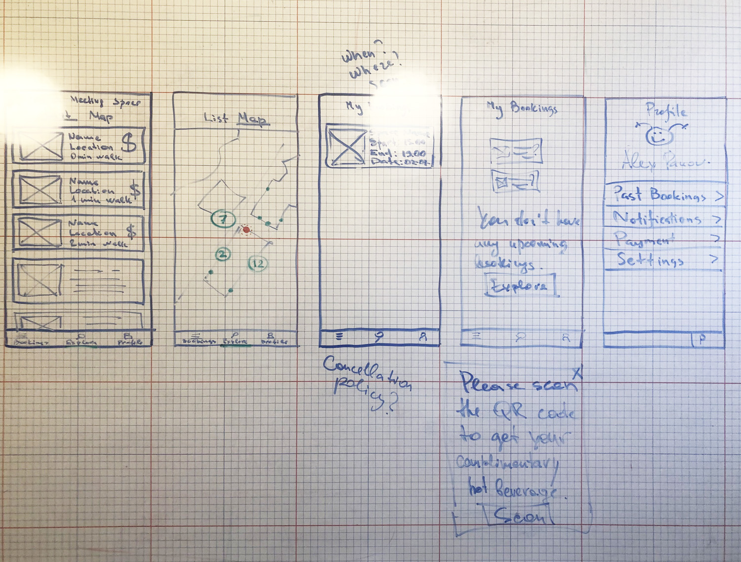
Using the user stories we came up during the previous phase we started whiteboarding and prototyping. The golden rule of prototyping - is to fail early and fail inexpensively. Prototyping enables misunderstandings to be identified and addressed as early in the design process as possible.Meanwhile, the UI specialist was refining the new voice, look, and feel of the platform.
Whiteboarding process:
Wireframing + low fidelity prototype creation:
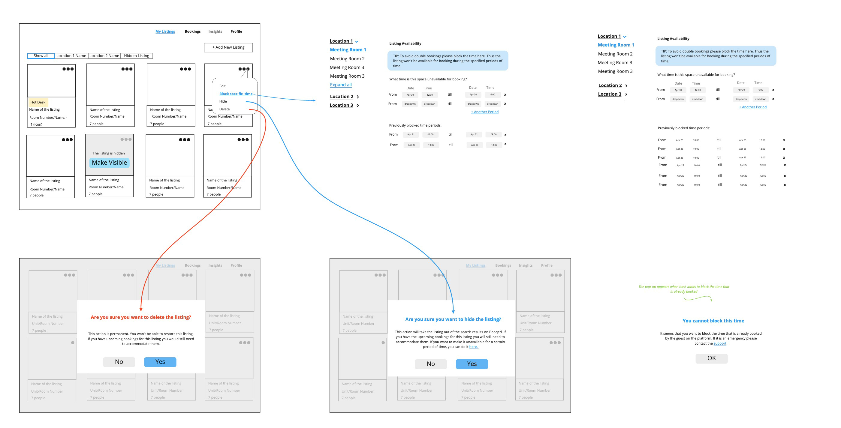
- Wireframes creation for all of the user flows including work on the copy.
- Continuation with the testing the solution we came up with.
- Application of the established look and feel on the platform.- User testing on the most complicated parts of the system.
We have been recording interviews from the users and then analyzing and splitting feedback to different categories. These categories are split into feedback from the users and then are filtered into problems that are crucial issues that are trends throughout the interviews. The crucial problems need to be fixed asap, because they had trends of problems from multiples users. Whereas, the other users that have different more individualized problems we decided to evaluate later and observe any trend patterns in the future.
It is not always possible to detect all of the issues with UX while testing the wireframes. However, during proper user testing session and using an attractive clickable prototype, it is easier for the user to feel that they are working with the real platform rather than with the set of more obscure wireframings. Thus, they provide higher quality feedback and emotions while using the product.
Insighty and Booqed team started the collaboration. We came to a mutual understanding of the problems that users had and agreed upon which parts of the user experience needed improvements. Success! The next steps were actually redesigning the platform, which happened over the next few months through lots of brainstorming, collaborating, check-ins, and user testing. It was an iterative process that involved lots of attention to detail.
Now we are working on the implementation of the redesigned version of the platform. Once the first version has been released, then we can measure the success of the design that we created for Booqed.